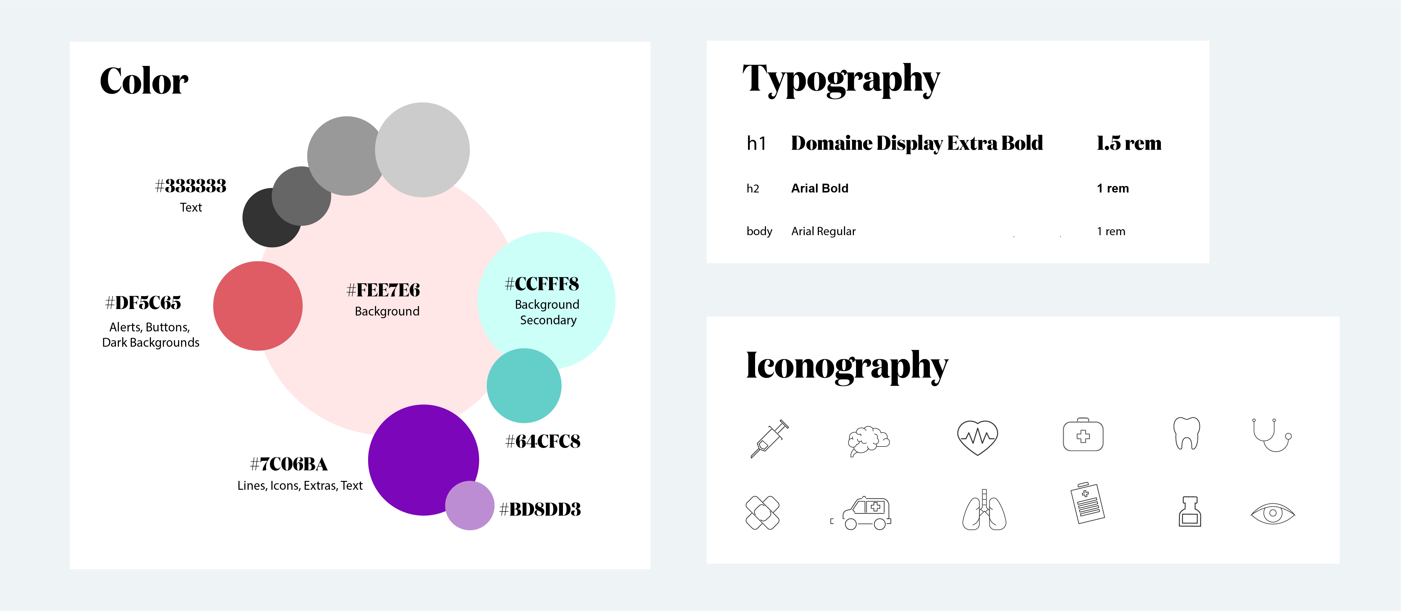
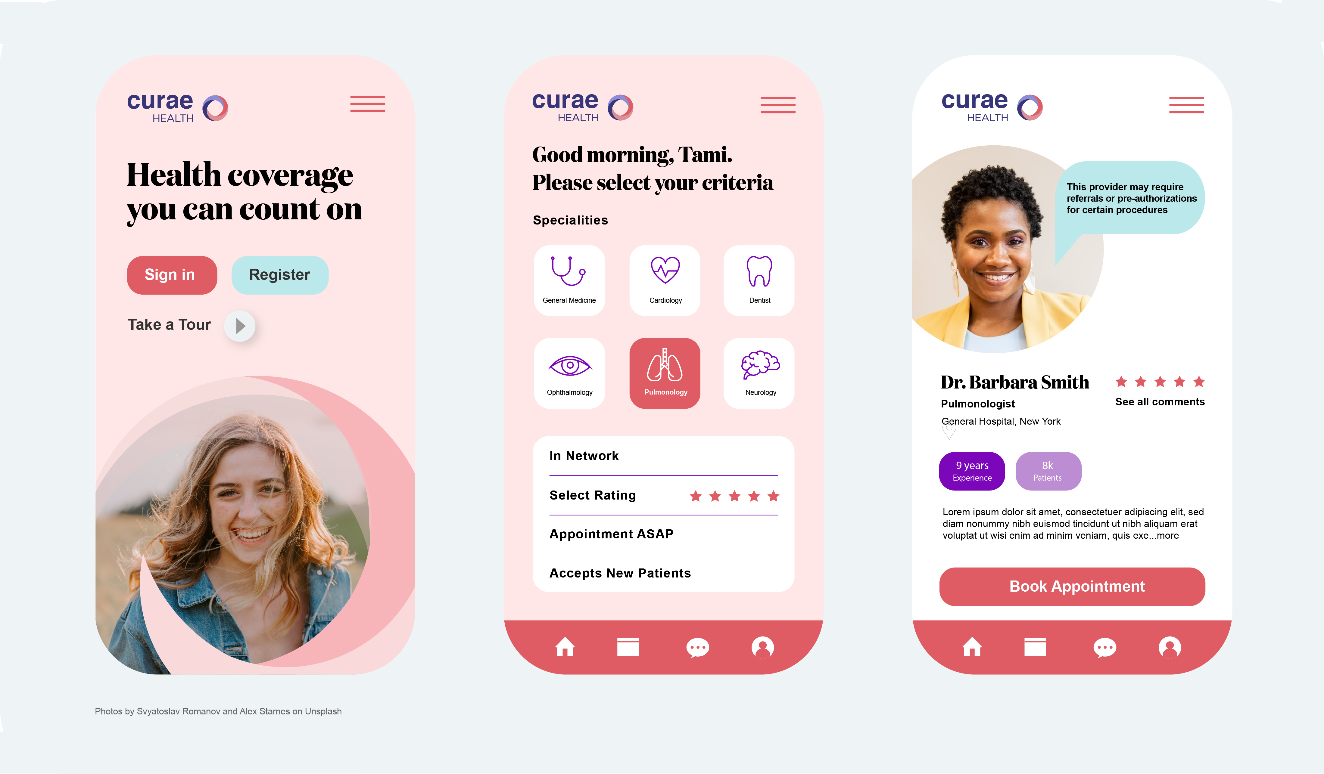
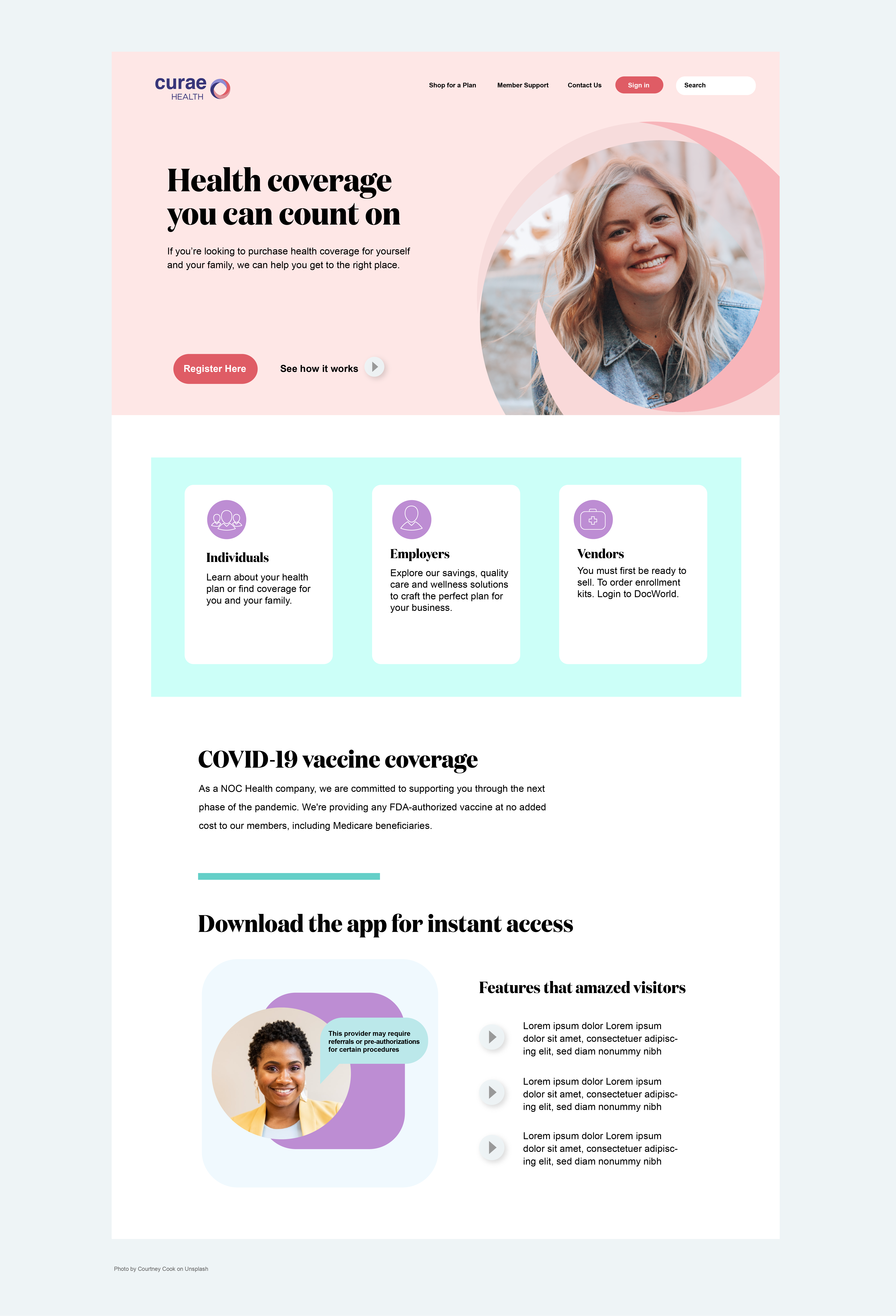
Curae

Persona and Journey Mapping Graphics


Curae is a pharmaceutical company that needed a brand refresh. The journey map and persona below illustrates some of the challenges customers face today in the healthcare industry: A.) People are developing health problems related to stress B.) Older people will forgo making doctor appointments because of hassle and billing issues with their insurance C.) The rise of technology means people are more connected to work: they have busier schedules and more demanding careers and no time for call lines.

Low Fidelity Concepting


Starting with mobile first, I have sketched out thumbnails concepts to configure the user flow and some of the features for the app.

Design System


With the final map of journeys and flow established, I started thinking about the visual identity of the brand. Here is the list of adjectives the brand embodies: caring, soft, encouraging, clean. Using these adjectives, I searched for inspirations and created a color palette which reflected these words. For typography, I used fonts that evoked the same feeling. The colors were chosen as pastels to create a soft feel and the iconography to keep a clean appearance.

High-Fidelity Mockups


Now that the flow and low-fidelity mockups are complete along with styles, mood and colors, it is time to create the high-fidelity mockups.

Creating a Web Presence


Next it was on to creating a comprehensive multi-platform presence starting with the website to mirror the app using a component-based approach in the designs to ensure flexibility and scalability for future product roadmaps. The visual language crafted extends the brand experience across iOS, Android, and web. Future plans to extend branding can include social media ads, email campaigns and any marketing needs.